KAI CI
We make the move from a representative of the Korean chemicals
industry to the leader dominating the Asian market
through innovative production development.
Confidence and effort are
expressed in word marks.
The new CI expresses in simple word marks not only the confidence of a petrochemical products manufacturer in an advanced industry that requires a high degree of technology, but its efforts towards a cleaner environment as well.
It sets blue, symbolizing youth, future, and knowledge, as its base color to deliver a pleasant image, along with the “a” design, developed from the image of an oil drop, to display professionalism in the work area.
-
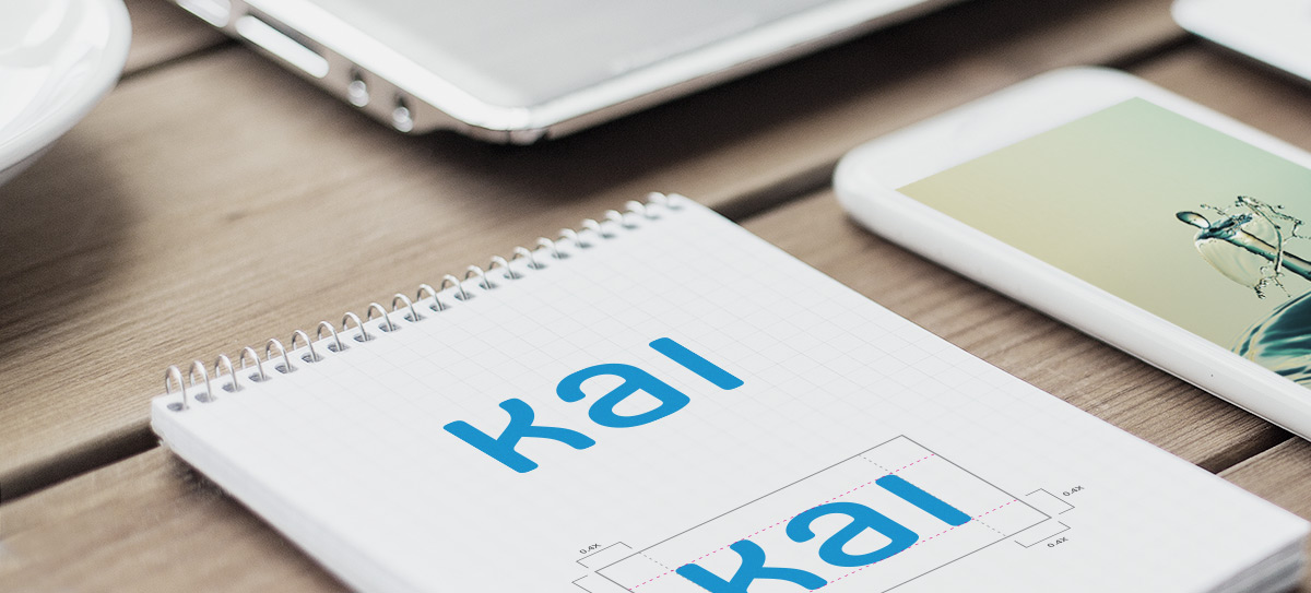
Logo type
The logo type is an essential design element that constitutes the identity of KAI along with the KAI logo.
The logo type may also be used to express the identity of KAI in place of the KAI logo.
-
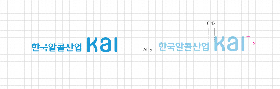
Signature
The signature refers to the combination of a symbol or a logo and a logo type. The KAI signature is formed as a combination of logo + logo type.
-
Graphic motif
The graphic motif is an essential design element that constitutes the identity of KAI.
The graphic motif may be applied in basic type and grayscale type (black, white, and gray), and use of other colors must be avoided.
Basic type 
Grayscale type -
Exclusive colors
Exclusive colors are an essential element that forms the identity of KAI.
They must be applied without any deformation or distortion in accordance with the proposed criteria.-
KAI Blue
-
Process Color
C75 M25 Y0 K0
-
RGB Color
R28 G154 B214
-
Spot Color
Pantone Color802C
-
Process Color
-
KAI Gray
-
Process Color
C0 M0 Y0 K50
-
RGB Color
R147 G149 B152
-
Spot Color
Pantone Color Gray8C
-
Process Color
-
KAI Blue